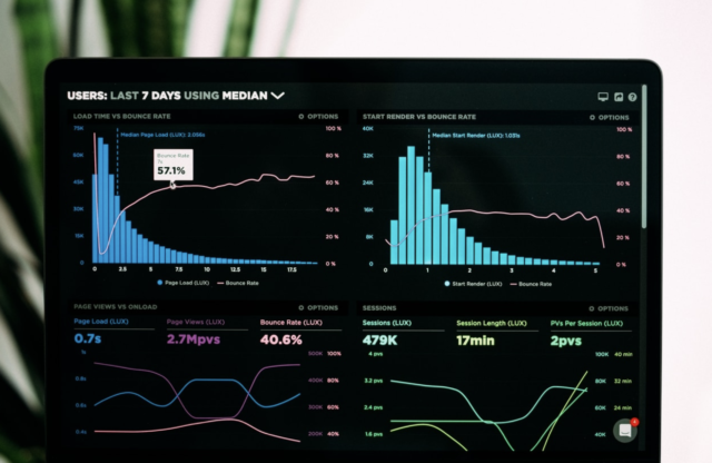
How to portray and explain complex problems? Numbers that are difficult to imagine must be presented clearly. And now, there is no better way, then to use interactive data visualization with processing. Suddenly, complicated data becomes simple to analyze and compare. Let’s see how to start working with data visualization in 6 easy steps.
1. Identify your goals
Contents
As with any tool or programming language, the use of interactive data visualizations with processing also requires setting your goals. First, identify what is it that you try to achieve. At some point you have to gather the raw data and present it in an wasy-to-understand, graphical way. The answer to this question is essential to create a visualization that will be useful to the client or recipient. The goal may be to support in making decisions through understanding the data better or to perceive features that may not yet have been discovered at this point.
2. Design a model
The human mind is fairly good at visualizing small numbers. As the numbers increase, it is getting harder and harder to imagine them. At some point you have to gather the raw data and present it in an easy-to-understand, graphical way. That is the reason why developing a conceptual model of how the data should be presented is so important. Building an intuitive dashboard with crucial data is not easy and definitely it takes a lot of time to prepare the final product.
3. Data Modeling
At this stage, it is important to return to working on the data. Interactive data visualization with processing requires obtaining all necessary information. Use data modeling to document each part of it and link it together in a logical whole. The analyst’s task is to become thoroughly acquainted with the content of the information as well as to carry out transformations between the data.
4. Visualize data and models
At this point, after defining the data, it’s time to visualize all the collected information. Try starting with simple tables and lists that will reasonably present a large proportion of problems. Here, often incomprehensible information is being transferred to, hopefully, comprehensible visualizations. Prepare yourself to produce a few rounds of mock-ups. Remember that user interface design will only succeed if it is consulted on an ongoing basis with both experts and potential users.
5. Interpret the results
To optimally test visualized data, you will need to reach a representative audience. Try to identify consumers who are genuinely interested in the problem you are presenting. If they appreciate your project, they will recommend it further. In another case, it will be a clear sign, that you still have to work on it.
5. Stay up to date
Interactive data visualization is one of those types of data presentation that never stands still. Interactive visualizations will quickly become out of date if you don’t update and improve them. Ask yourself new questions, look for new connections between the information and make new hypotheses. More complex data presentation may not be the best solution so try to simplify the message as much as possible. And most importantly, never stop gathering feedback.


