SEO is obviously one of the typical tools to become a leading option in Google search ratings and be shown above the competitors. However, creating a multioperational and efficient website includes several steps and tools, so sticking to SEO only will surely limit your opportunities.
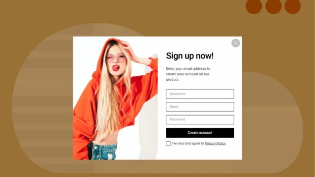
Enticing users within domains is possible thanks to lightbox popups. Along with appealing deals, personalized branding, and qualitative copywriting, these messages provide a second chance for readers to fall in love with your webpage. Stay tuned to find out the genuine value of these small windows that overlay the original site’s background.
Benefits of Using Lightboxes on Websites
Contents
Popups are excellent tools to occupy attention spans in the modern traffic jam of advertisements and competitive marketing campaigns. The list of their advantages includes the following:
- It is a brilliant chance to capture abandoning visitors with the right triggers that are represented at the best moment. Their decent value is considering true visitors’ interests and focusing on their real needs.
- They simplify user experiences, letting them perform particular actions or access certain services faster and smoother — from signing up and placing to finding an enticing bestie at an affordable price.
- Lightboxes will reinforce the information provided on your site.
Here are some samples of high-converting popping-up messages:
- If you present free services here and now, that will make customers stay with you longer.
- Without a doubt, discounts are always in demand. Whether it is a percent-off for customers’ first order or sales in front of Black Friday, you set up a conversion trend.
- Sharing information, including guidebooks and step-by-step instructions on how to use your products such as specific dog supplies will be suitable.
- Interlinking your website pages is another great strategy. It is a good opportunity to get acquainted with the models that are similar to what the user has already analyzed.
Are Popups Efficient for Conversion Rates?
If you long for more preciseness, the statistical data will come in handy. The information below will illustrate the influence on your website performance. Analyzing this percentage, it isn’t under debate that this data isn’t absolutely applicable to your business completely — divergent services and multiple other factors change the final outcome. One thing is clear, popups are excellent tools for several sites and needs:
- The conversion rate differs, depending on what platform is applied. The ratio between desktop and mobile domains is nine and a half percent to eleven percent accordingly.
- The lightbox content is crucial. By adding images to its layout, it is possible to almost double their popups’ conversion. Here is a quick practical tip for you: if you aren’t sure what solution is better, you can always test both methods and see their promotional value.
- With the help of countdown timers, interested parties introduce more scarcity to their advertising and marketing campaigns. The increase from around four to eight percent in conversion is meaningful. Of course, it doesn’t mean every lightbox should have this feature. Its presence will surely complement your short-term promotions and limited deals for customers.
- Defining the optimal number of input fields, the statistical analysis shows that popups with one and two inputs are top-rated. Solutions with five inputs can work as well, but they will be a bit more cumbersome and demanding than expected.
- There are many cases when enthusiasts implement multiple-step popups on their websites. Simpler one-step lightboxes are more productive. On the contrary, there are scenarios when adding an extra popup is worth it. For instance, this campaign is used for enhancing the site cart efficiency or yes/no forms.
The Most Convertable Popups
If you would like to avoid any controversial matters relating to your site functionality, it is a must to pay special attention to visual and information content. With the increase in conversion, the revenue is usually driven higher. This is only possible when end users are satisfied with how such popping-up messages are designed and operated. Choosing between side messages, gamification instruments, and standard tools, the following principles are obligatory to stick to:
- Context — to get rid of causing dissatisfaction, distraction, and frustration by inappropriate lightboxes, engaged members are welcome to connect their popups with what is going on on the webpage. The message can become a bit tricky and offer certain incentives to perform the shown call to action. For example, that could be a first-time user or military discount, which is available after registration only.
- Relevance — taking into account the overall context is similar to preserving relevance in your popups. If a person seeks a pair of earrings, offering discounts for pendants in the popping-up format will turn into an annoying experience for your site visitors.
- Personalization — user segmentation will help you provide the right messages to your audience. Let’s assume that there is a store, selling silver jewelry, and it tries to attract more consumers with sayings like “perfect wedding band” and “birthday gift ideas”. Both of them can be functional, but your branding and the designs of the products you offer will determine their final worth. It is a wonderful tactic to create different promotional messages for separate categories of your web to maintain the best personalization degree of chosen popups.
Whatever style of popups you are going to select, placing yourself in your customers’ shows will be beneficial. It will enable you to create bridges between your expectations and the right methods to satisfy the original goals.
Conclusion
All in all, the way your lightboxes largely depends on your dedication. With the help of intuitive tools like Claspo, enthusiasts can break the statistical boundaries and keep on enticing their audiences with top-notch deals. As a new layer of communication, the style and overall beauty, relevance, and functionality of popups shouldn’t be omitted.


