![]() Price: $2.99 Score: 8/10 Category: Finance
Price: $2.99 Score: 8/10 Category: Finance
Economy for iPad is one of the few apps in the iTunes store that moves the needle on what it means to own an iPad. This app from Cascade Software Corporation puts up to 40 years of economic indicators at your fingertips, and lets you scroll through everything on demand.
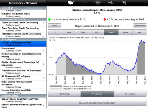
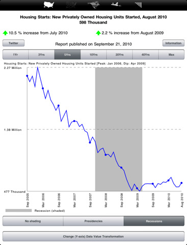
To get an idea of what Economy for iPad is like, picture an aggregated database of publicly available charts from the United States Federal Government Agencies. There’s GDP, Manufacturing, Inflation, Consumer Spending, Trade Deficits, Housing, Manufacturing, Employment, weekly updates of Canadian and Mexican Exchange rates, and much more.
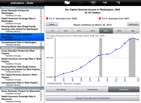
Everything is displayed via thumbnail buttons along the top that let you navigate national, state, and North America based indicators via a drop down chart. The states drop down organizes the 255 indicators by state, and national statistics are grouped into Business, Commercial Credit, Employment, Federal Debt, Gross Domestic Product, Housing Sector, Inflation, Interest Rates, and Monetary Aggregates.
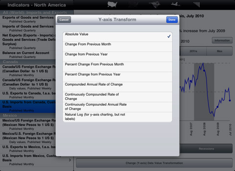
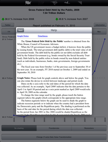
When you dive into the actual charts you’re presented with a normal white page with the graph, a couple trend arrows, an information button that displays a thorough explanation of the chart. You’re also given a series of gray buttons that let you change the Y-Axis on the graph, look over the graph for different lengths of time, and then shade (or choose not to shade) the stats to clearly display presidencies or recessions.
You can use the Twitter button on the upper left hand side of all the graphs to tweet out your analysis in relation to the graph by tapping, signing in, and then letting the app access your Twitter. Each post is automatically generated based on the chart you’re looking at, but unfortunately it doesn’t look like you can link to graphs or anything of the sort. Instead tweets end up looking something like the following with no real means for putting the graph into perspective:
“Gross Federal Debt: 2009 $11.9 Trillion [18.9% increase from 2008, 32.7% increase from 2007]’
While the graphs alone are enough to keep you locked away in a deep state of scholarly thought, the more connected user will probably enjoy the upper left hand corner menu that gives access to Economic Tweets. There’s also a link out to the Cascade Software blog, which talks a lot about apps and gives a face to the creators, though it’s not that related.
On the whole, this is an incredibly powerful app. I’ve been hard pressed to find a comparable resource on the iPad and think this is a great means for staying informed and on the ball. That said, I’m not sure that Economy for iPad’s visual layout does the app justice. There’s no search function to be found, you can’t zoom or scroll within the charts (aka they are static except for the grey buttons you can push to modify specific factors), and there’s not really any way to share the information you’re digesting with other people visually.
Could this app improve? Definitely. The information is bare bones straightforward and presented in an extremely raw form. Economists don’t have to win graphic design awards though, and if it’s information you want then you’ll certainly find it here.
Bottom Line: The design may not be the most efficient, but if you need to stay in the know Economy for iPad is your down and dirty, number one resource for aggregate information on the economy.


