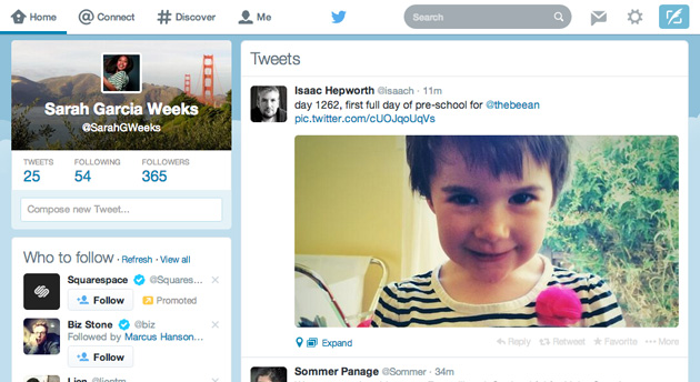
Not all users are able to see it just yet, but Twitter is rolling out a new web design which will get rid of the pop-up compose layout. This is the latest move by Twitter to make its web interface more like what is found on mobile devices, where many of Twitter’s users are.
 Similar test versions of the new design have been spotted since 2013 but it appears as though the people over at Twitter have finally landed on the best layout.
The compose box (arguably the most important part of Twitter) is no longer going to be brought up via a small button near the top of the page. Instead, it will be located on the left side of service and will be found as a compose box.
It has been estimated that only 1% of users are able to see these test versions before they go live. These people are generally used by Twitter as guinea pigs in order to gauge how well a new layout or feature will be accepted by the general public.
Based upon the responses that have already started to come in regarding this design, many Twitter users are happy with it and find it more appealing that the previous web layout which had been in place for quite a while.
There are numerous changes present with this update outside of the compose box, including an overall cleaner and lighter design with an emphasis on Twitter’s main color, light blue. Although the web layout is distinctly different from the design found on mobile devices, Twitter is obviously moving in the direction of having all of the designs in sync with each other.
We’re now rolling out a refreshed http://twitter.com reflecting the look & feel of our iOS & Android apps, – Twitter
Just last week, Twitter announced that it would allow users to use its service in order to ask questions and interact with the Twitter team during the company’s earnings call on February 5.
Summary: Twitter is beginning to roll out a new web layout for its service. The updated design is meant to keep the designs present on the web and mobile versions of Twitter in sync with each other. Among the changes is the removal of the pop-up compose function.
Image Credit: engadget


