Android’s new version, named “P” is an huge improvement, in terms of user experience, over the Android we have all known till date. To make these huge improvements, Google just had to make some small tweaks, as we all know “it’s the small things that matter”.
Android P is a game changer when it comes to navigating through apps. It introduces a new tiny slider/button just like the one found on the iPhone X or on webOS devices in the past. However, it’s much smaller, and does a lot more than its counterparts. So, users can now swipe up from the slider to get a view of their open apps and the most interesting thing is that, those open apps are active and interactive, meaning users can actually toggle options of an app right from the app switcher.

I call it the slider because it also allows users to scroll through the open apps just by swiping (scrolling?) through it. The button/slider completely changes the way Android has worked from the beginning and its good a sign that we’re finally going to see Android go head-to-head with iOS in terms of quality, good UI and stability.
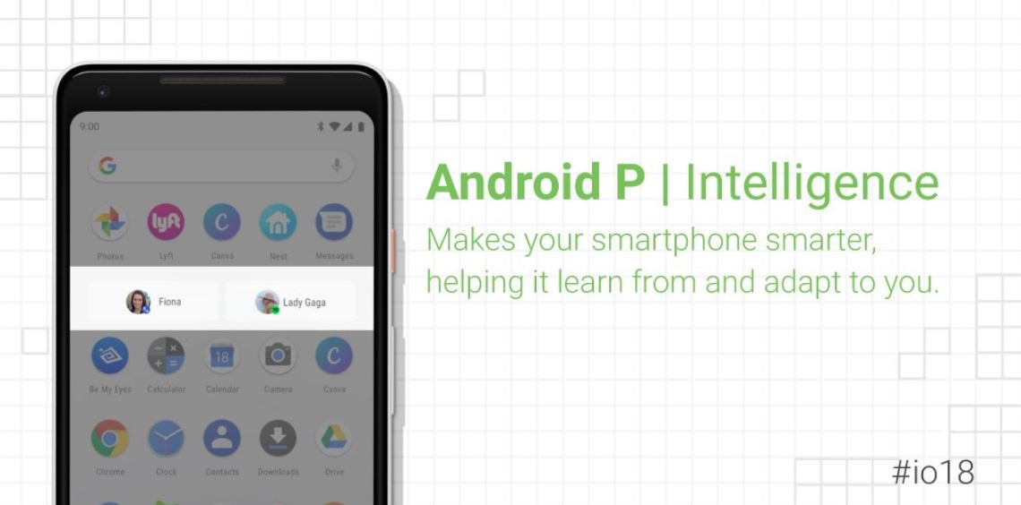
Google has been talking about AI a lot for sometime now and it was the same case at this year’s I/O too. Android P relies on AI a lot – for improved battery life, improved brightness, and for not big-of-a-deal but good feature “recommended apps”.

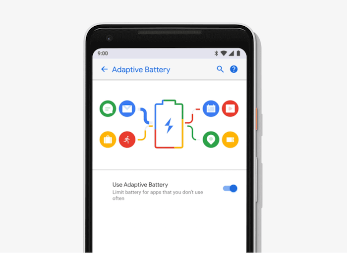
Android P will study how an user uses the phone and over a period of time that is after understanding it, Android will automatically put apps to sleep or if the user uses the app very rarely, it will be put in a complete rest mode. This process of managing app states should improve battery life by thirty percent, according to Google.
The new version of Android has a lot more of under-the-hood improvements and features which as a user point of view are not essential but if you’re a developer, check them out at Android P’s official page.


