Apple has undoubtedly had an incredible year in 2012, both in innovation and financial turnover; It released two versions of the iPad, a new iPad mini; a completely redesigned iPhone and iPod touch, as well as iPod Nanos, super-thin MacBook Pros with Retina display, and a newly designed iMac. In addition, there is no short of rumours surrounding what Apple should invent in the future, but taking a more realistic approach, here are the 4 things Apple should bring to 2013. Most are software based given Apple revamped and introduced updates to almost the entire hardware range.
Redesigned Apple TV Interface
Contents [show]
So although Apple have been dripping through updates to the Apple TV interface over the past year, iTunes 11 just got a completely revamped UI and there is a rumour Apple is already working on an iTunes 11-inspired Apple TV interface. Currently ATV has an iOS Springboard look with big and colourful buttons and the old frontrow style submenus, but it always felt Apple was holding back with the UI, so it will be interesting to see an iTunes inspired feel.
A few additions such as BBC iPlayer and perhaps an iTunes style visualiser for when playing music would also be a nice touch.
Updated iLife for OSX
The latest version of iLife came out on October 20th 2010, over two years ago, but with the focus seemingly switched to iOS, it seems nothing more than a hope that Apple will add any more features to its once flagship software. Welcomed updates would be specifically around Aperture and/or iPhoto to introduce new filters and image processing tools.
Skeuomophism removal
I was never a fan of the skeuomophism approach, and now with Scott Forstall removed from duty and Jony Ive back in charge of design, it’s almost certain we can see an update to the graphics in iOS 7 and OSX 10.9.
Notification Redesign
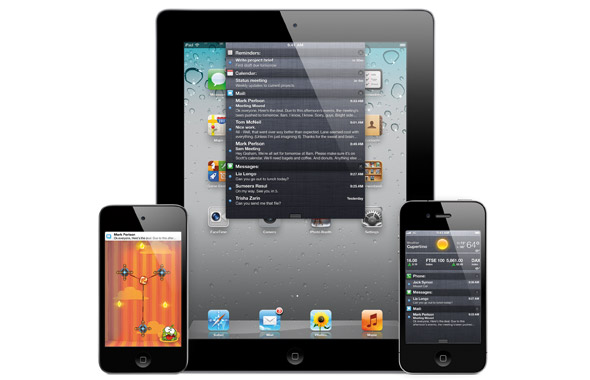
iOS 5 introduced a new notification centre and overhauled notification banner design. Those are annoying to say the least, with notification banners often covering the navigation buttons in Apps, the dreadful sizing of the notification centre on the iPad, and the mechanism for clearing those notifications. Now with Jony Ive at the wheel, and with so many notification centre design concepts floating around the web, it can be expected that we’ll see something different in iOS 7, and I for one hope this is the single change, if any, that happens.
Well these are the 4 things I would like to see changed, let us know what you would like to see in 2013 in the comments section below.


