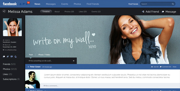
Facebook, the social network that has over one billion users, has started to look a little old and shabby, despite the thousands of designers and developers working on the site daily to make improvements.
One designer, on Behance, has recreate Facebook from the ground up, keeping most of the features while completely recreating the experience and design of Facebook. The classic blue and white is still there, but the whole concept of reading your newsfeed and browsing profiles has changed.
The designer, named Fred Nerby, describes the project as “a conceptional and systematic design approach for a new responsive desktop and iPad concept to the largest networking platform in the world, focusing on a more streamlined solution for its online space and created behaviour.” He spoke to The Next Web about his project.
The redesigned Facebook is not only creative but it makes Facebook a lot more fluid and colourful. Even though Nerby kept the same colour scheme, the blues and whites really come out and draw your attention. The difference in the design is amazing though it is still very simple and elegant.
In many ways, this represents the change in design we are seeing many developers use, instead of text blocks and rounded squares, developers are looking at the Windows 8 experience and Pinterest as the leaders in design.
We see this a lot, squares and rectangles and fluidity in the webpage or operating system is becoming one of the most loved ways to curate all your social networks or information. On Pinterest, we enjoy the boxes as a way to view all our ‘pins’. On Windows, we enjoy them as a way to separate our content.
Facebook may not pick up on this designer and even if they do we doubt they will look to completely change the way Facebook works. But this is one of the first designers we have seen that have looked at Facebook and made a way to do it better.


