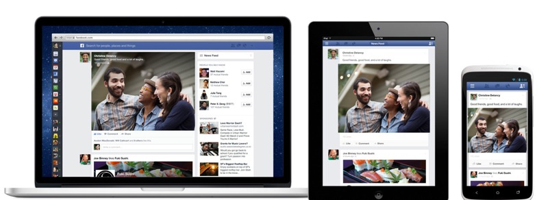
Facebook, in its Media Event today, announced significant updates to the way its News Feed is displayed to users on its desktop, smartphones, and tablets. Facebook has established the News Feed as its signature look over the years, updating the way it displays your friends updates. It has quickly become the best way to keep up with what your friends are up to.
The focus of the redesign is to replace the amount of text shown in peoples News Feed with more pictures and media rich content. Shared images and video content have been enlarged to add emphasis, together with various sub-feeds to allow readers to focus on photos, music, or liked pages. The update to Facebook’s design also unifies the look across different platforms so users will feel at home whatever device they view Facebook on.
Today we’re announcing a new version of Facebook designed to reduce clutter and focus more on stories from the people you care about. You see all the stories you saw in your News Feed before, but with a fresh new look. We’ve completely rebuilt each story to be much more vibrant and colorful and highlight the content that your friends are sharing. Photos, news articles, maps and events all look brighter and more beautiful.
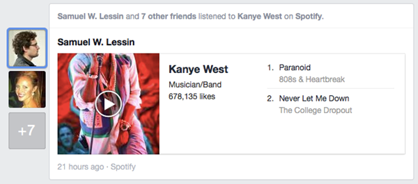
Filters have also got a big focus on the new Facebook design, allowing a user to view all friends activity in chronological order, or just photos, or even just Music which leverages friends check-ins to locate nearby concerts. There is also an upcoming events filter that will inform you of events your friends are attending in future.
Users can sign up for a waiting list to get the new design activated on their profile by scrolling to the bottom of the page. Smartphone and tablet versions will be rolling out over the next few weeks.


