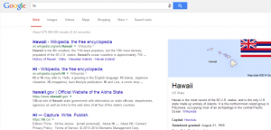
Google has now confirmed that a handful of changes are being rolled out to Search, among those changes are a larger font for search results and an altered ad box.

Outside of the increase in font size, which primarily affects the titles and not the URLs, Google is also getting rid of the old ad box and replacing it with a small yellow tag that says “ad” next to the result. Prior to this update, the desktop advertisements were placed on a shaded background, making them easier to identify with a quick glance.
Even as of today not all users will be able to see the new search results page, though more people are receiving it. A complete roll out probably will not occur until the complaints have been examined and final touches have been implemented.
Some of these changes may be part of a push to unify the layout and design of Google Search among different platforms. This has been one of Google’s major goals for its search engine according to senior VP Amit Singhal.
We’ll keep improving Google Search so it does a little bit more of the hard work for you. This means giving you the best possible answers, making it easy to have a conversation and helping out before you even have to ask. Hopefully, we’ll save you a few minutes of hassle each day. So keep asking Google tougher questions—it keeps us on our toes! After all, we’re just getting started. – Amit Singhal
So far, many people have complained about the new design being implemented by Google, yet the roll out is continuing to grow.
