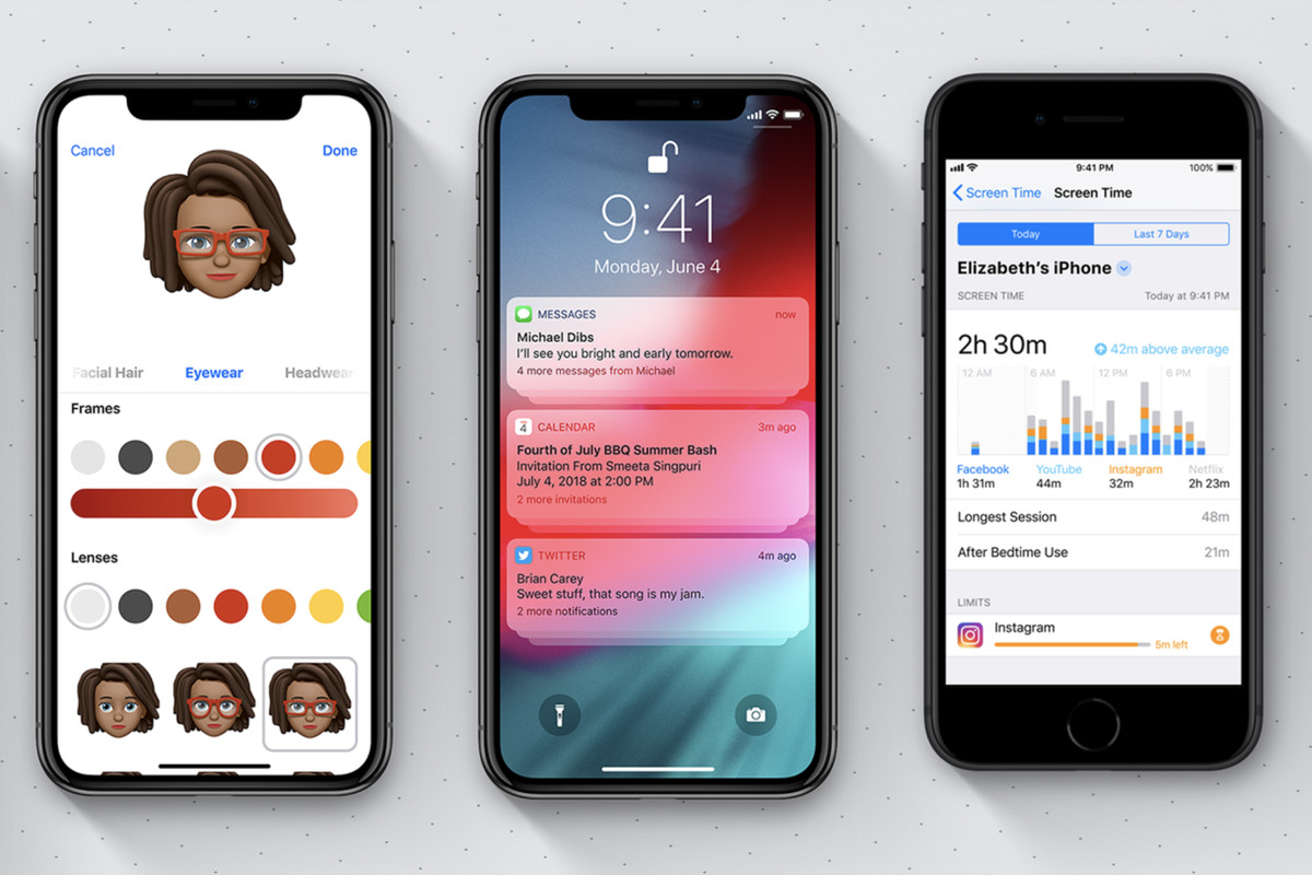
Apple refreshed the look and feel of iOS for the first time in 2013 with iOS 7. This year, it’ll be iOS 13 that will be injecting itself into all eligible iPhones and iPads. With almost six years having passed by with the same design but with some tiny updates over the course, a design refresh is pegged.
Apple says that, iOS is the most advanced mobile operating system, something people will readily argue about. However, it can be easily said that, iOS is the most secure and the most stable smartphone operating system. But that doesn’t mean that, it’s perfect in every sense and has no flaws of its own.
New look and feel

Take for example the volume UI that pops up when the level is to be lowered or upered. The volume UI almost blocks everything that appears on the screen. Also, it takes a couple of seconds for the volume box to disappear; it’s high time that Apple fix it. A less obtrusive volume bar at the top or the side would be much appreciated.
With phones turning larger and larger, also with the iPhones taking the same path, its turning out to be difficult to reach the “back” button that is placed at the top of the apps. It’d be nice if Apple could figure out a way to place it at the bottom or create a gesture for the same down below somewhere near the software home button.
Updated apps

The default Mail app on iOS is one of the apps that has long been needing an update. Many users tend to flock towards the Gmail app, the Spark email app or other paid email apps. The “Mail” app clearly lacks behind the competition and it would be nice for Apple to finally make some changes. Categorization of mails like the way Google does it, would be nice.


