We have seen at least ten new features of iOS 7 at Apple’s WWDC 2013 Conference on Monday morning, and there are some iOS users who have complained about some of the icons ever since. One writer from The Verge wrote the following regarding his first impressions of iOS 7:
The icons are striking to see, and they’re the first sign that there are points of confusion and even missteps in Apple’s new approach. For starters, the icon styles vary wildly from app to app. Game Center is now a collection of 3D globs, rendered together against a white background, while the Camera icon recalls something more like clip-art…it looks shockingly basic, and more childish than elegant. The same goes for Weather, an amateur mishmash of sun, clouds, and a gradient background that was highlighted as part of Apple’s new ‘”grid system.”It might be on a grid, but it doesn’t look very good.
The writer’s comments above have been echoed by quite a few individuals in the industry. It’s not uncommon to read these words. At the same time, however, Apple has been busy since its Monday announcement at WWDC 2013, and some of the iOS 7 icons have now been changed. What are some of the iOS 7 icon changes?
iOS 7 Icon Changes
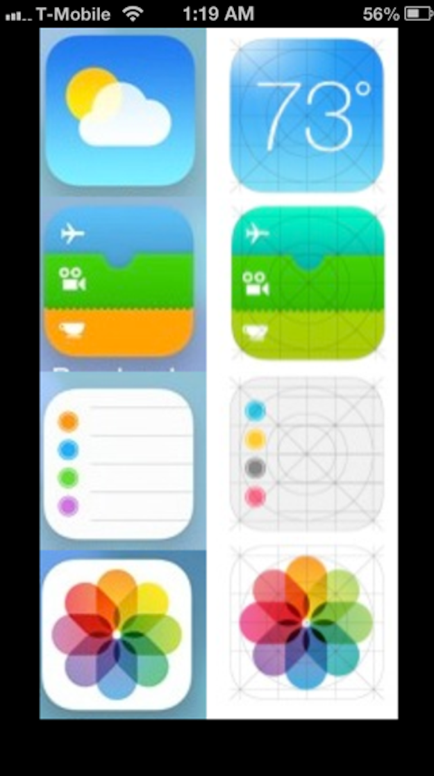
The iOS 7 icon layout below shows some of the most significant changes Apple made to iOS 7 icons on its website earlier:

Here is a list of many of the iOS 7 icon changes Apple made:
- Weather icon has live temperature in place of clouds and sun
- Passbook loses orange color for a different shade of green
- Mail icon has more rounded corners instead of the usual square background
- Reminders loses the bright orange, green, and purple for gray, pink, and yellow
First, the weather icon is one that many have complained about, including tech site BGR, with its well-titled article “It’s Always Sunny in iOS”:
A warm front swept through the Mid-Atlantic region late last week and drove the temperature up into the nineties. It was humid and uncomfortable in New York City, but in iOS it was 73 degrees and sunny. In the dead of winter as snow blankets the Northeast, and during sweltering summers while heat waves test our patience and our power grids, it’s always 73 degrees and sunny in iOS.
Apple’s VP Phil Schiller said once that placing a live temperature on the weather app’s display would drain battery life, but the change to the weather app is indicative of Apple providing what consumers want.
Passbook and Reminders in iOS 7 Use More Refined Color Scheme
Have you gotten the impression that some colors of the new iOS are, as The Verge put it, “childish”? I would have to agree. After all, pink may be my best friend’s favorite color, but I do not want to see pink all over iOS 7 when I purchase the new phone this Fall. IOS 7 may be formatted this way so as to appeal to children, who find the iPad particularly easy to use and enjoy its gaming and educational experiences.
However, Apple has toyed with the possibility of ditching some of the super bright colors in iOS 7 for somewhat darker tones that will hide into the background rather than stand out somewhat awkwardly. The orange color on Passbook has been substituted for a more olive green color. As for reminders, it has been substituted with the colors that are used in the Game Center app. I think this was done to make iOS 7 more uniform in its color scheme.
Apple has been working on the aesthetics of its iOS 7 user interface. According to an iOS 7 update, however, the changes have been removed from the company’s website and replaced with the former icons and color schemes. Could Apple’s public revisions be a mistake, or are they indicative of new changes that the company would rather reveal this Fall with the arrival of the iPhone 5S? What changes would you like to see in iOS 7’s user interface by this Fall? Let us know in the comments.


