There has been a lot of talk over the new Gmail challenger, Mailbox. The app is currently running on iOS and is free, although there is a steep waiting list for anyone that wants to join the crowd.
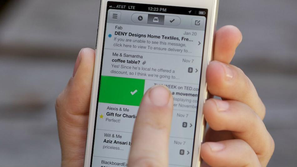
Essentially, the Mailbox client has no feature that isn’t on Gmail, it just gives the user a new interface to test every feature out. Mailbox is generally a lot of swiping and gestures, instead of touches.
Sparrow was the previous Gmail app client that many users fell in love with and Mailbox builds on that foundation of great design, excellent functionality and overall a better performance.
The Mailbox interface works a lot like Clear, the to-do list app for iOS. The swiping to delete emails is one of Clear’s best features. Mailbox runs over the cloud and generates your email before you go onto the app, for faster loading speeds.

Messaging on Mailbox seems a lot more like tweeting, the format is made for informal conversations and short messages, rather than paragraphs of information. This is true to the movement we are seeing in email, for users to be more informal and light on their messages.
Right now, Mailbox is only available on iOS and as we have seen before, iOS gets the best apps first. We believe Orchestra, the company that made this app, will add a Mac variant and possibly an Android app.
The queue for this new app is still pretty big, if you download the app now, you are likely to be in a queue with over 800 thousand people in front of you. The client works on a first come, first served basis, so if you want it you should get it now.
The Mailbox app is, as we have said, free, for any user. We have yet to see Mailbox end goal, a way to make money, but we suspect between cloud storage and premium features, Orchestra will find a way to gain some revenue.


