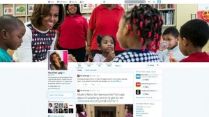
Upon reaching the main Twitter website and logging in, you will be greeted with a notification telling you that you can update your profile. Once you do that, everything is taken care of. Depending on what sort of profile photo or background you had before the update, you may want to change them in order to make things look a little nicer.
See Also: Twitter Begins Major Facebook-Like Design Change Roll Out
As someone that has always disliked the feed view on profiles, I’m glad that Twitter has now made “Tweets” the default feed, with “Tweets and Replies” being secondary. Before the change, everything you put out was clumped together which made replying to people slightly annoying because your other content would get pushed down and out of view.
The new cover header design is also quite nice and it follows the design strategy of other social networks like Google+ and Facebook, both of which allow massive header photos.
See Also: Twitter Tests Way To Hide Hashtags, Replies
One of the few things that it is no longer right out in front is “lists.” Many people do not use lists as it is but for those of you that do, you’ll find that area underneath the “More” button.
Overall, it is fair to say that Twitter looks completely different now that its design has been updated. Though it looks like a true social network now–it may even bring on new users as a result–its functionality has not substantially changed. The only real features added to the service with this particular update involve the way tweets are handled on a profile. So, it is now possible to “pin” a tweet to the top of a feed and popular posts appear larger so that they standout.
If you have anything to contribute, make sure to add it in the comments section!
