Gmail is the best email service on the planet, something that everyone will agree on. Yahoo has its loyal users who might not agree to this but Google’s service offers few features that make life easier. Here are three of those-
1. Segregation

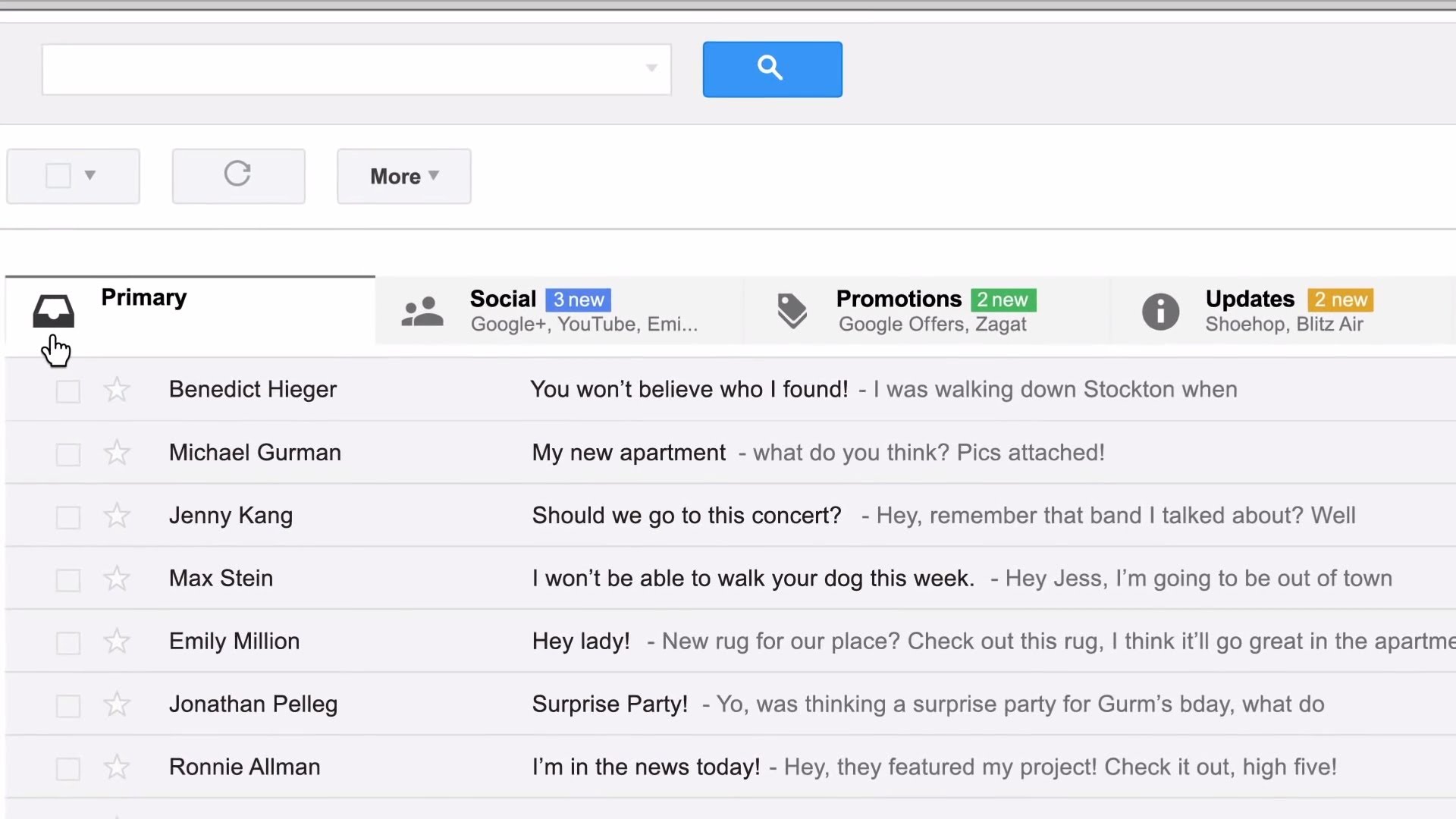
In 2013, Google introduced automatic segregation of mails and it made me ditch Yahoo’s offering. More commonly, this segregation feature is known as “tabbed interface” in terms of design.
It’s very simple. You can create required number of separate tabs, such as Inbox, Updates, Promotions and as tabs’ name suggest, Gmail will automatically segregate the mails and put them in their respective tabs.
2. Ads or Me? You’ll have to choose

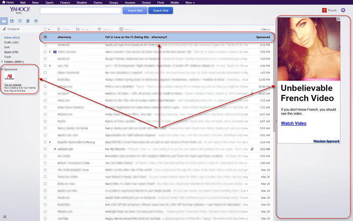
Ads are all over the internet. That’s how most of the websites on the internet and companies that focus solely on the internet make money. Well, Gmail is also an internet service but its not filled with ads and neither do they take someone’s mind off their work.
The only place I see ads in Gmail is in Social and Promotions tab. I rarely open those two tabs which makes Gmail almost same as an ad-free service for me. Yahoo Mail lacks this subtleness as it displays long ads on the sides. Well, you may ask, then how does Google make so much money (from Gmail), we’ll save that for a later time as it can’t be explained in few words.
3. Inbox by Google

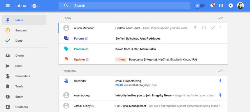
If you think, Gmail’s design looks old in the smartphone age. Then you should try Inbox by Google. It’s design is super clean. It focuses more on the content and less on menus; there are no sidebars like the ones in Gmail either.
It’s super intelligent too- it can remind you to do stuff, it displays updates with images (like Amazon’s shipment details), it takes Gmail’s segregation system a step further, and it also allows users to snooze reminders or mails meaning the mail or the reminder will show up at the given time.


