We’ve talked extensively over the weeks about iOS 7, it’s potential redesign, and what influence Jony Ive may have on the upcoming iOS 7, so much so that it could even be delayed. It is expected that Jony Ive will bring a flatter looking design to iOS 7, making everything more simplistic and visually appealing. Alot of people have tried to predict what this may look like, and here is another concept that is definitely worth a mention.
iOS 7 Concepts Emerge
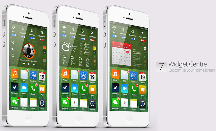
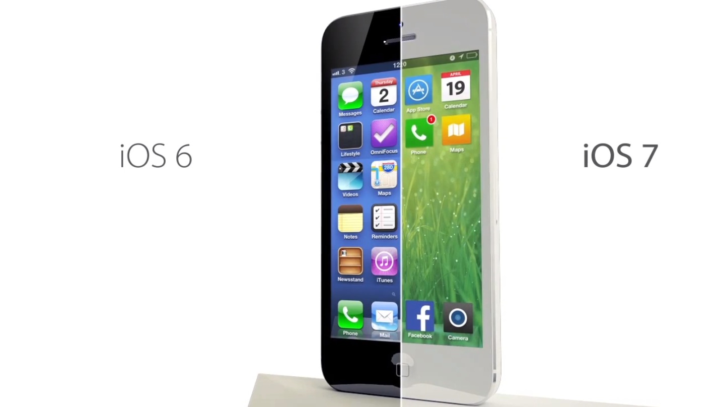
Coming from digital agency Simply Zesty, this concept focuses on a simplistic UI with flat design aspects, completely overhauling the look of iOS as we have known it all these years.
More functionality has been given to the notification centre, with widgets being introduced and are very clean looking in their own right, together with square icons with flat colours which replace the usual round gradient icons.
Everything looks fundamentally cleaner and in my opinion takes iOS to the next level. As WWDC 2013 approaches, more and more concepts of iOS 7 appear and all look better than the last.
The only problem with this iOS 7 concept is it is such an overhaul that it may be risky for Apple to change so much in a single go, but it would explain why we have heard rumours about iOS 7 being delayed, and extra engineers being pulled in from other projects to lend a hand with development.
Out of all the concepts I have seen, this is definitely my favourite and if this was released at WWDC 2013, it might just tempt me back from Android. Some say it looks very much like Windows Phone 8, but is that necessarily a bad thing? WP8 is a great, simple design, and something iOS could learn a lot from, and this concept takes that design and gives a unique Jony-Ive inspired spin on it.
Let us know what you think in the comments section below.


